
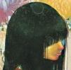
 Modern fashion magazine covers, especially those of a more mainstream persuasion, tend to annoy me immensely via something I like to call text vomit. It's a syndrome that, curiously enough, is something I see chiefly- in fact I'd go so far as to say only- in fashion magazines (all that info on how to make ourselves stop looking like crap that we'd probably be too thick to find if it weren't spelled out in bold on the cover?). And it's worst when the fonts are in a colour that don't even vaguely mesh with the photograph. Which is why Nylon, which is a magazine I don't actually read that often, needs to be commended for
a) realising it's got a good thing going with its cover girls and not blocking off too much of the image- excellent image, too, I love the purply-bluey-pinkish patterns and whatnots going on in there, and that's even without their choice of covergirls (wonder if Chloé- the brand that is, not the lady in the centre- has got something high-profile coming up soon? Fresh perfume push, maybe?). But I do love the styling on Chloë the girl and Clémence, especially the former- checked shirts have had dibs on my soft corner since I was fourteen, and it's rather a kick to see one on a cover..
b) Colour-coordinating the text to the girls' clothes. It's not often that brightness is actually harmonious, and methinks this cover is quite an achievement that way..
15 comments:
The cover is fabulous! And yes, you're right, it's so annoying when the cover is covered by loads of text!
I agree with your remarks, I'm sure many liked that cover..I don't pay much attention to fashion mags (Nylon included), but from now on,I'll check their stuff more often.
triple goodness on the new Nylon cover - I tend to agree that Nylon covers are the best! Uncluttered and attractive.
Chloe Sevigny gets a lot of indie press in this country...I'm not entirely sure why. I don't quite get New York's trendy set.
good point. this cover is far more cohesive than most.
You should check out photoshopdisasters.blogspot.com to see some examples of poor models & celebrities photoshopped into contorted, obviously plastic (fake arms) images to allow the text to fit. It's really horrible when you start to notice it.
This is definitely a good example of *not* doing that.
I also completely empathize on the creepy guy thing. It's really mind boggling how this can be acceptable behavior in any culture, or that a guy could fail to understand how messed up it is to approach someone this way. Totally hate it, and sympathize.
Word. Nylon used to have amazing covers several years ago but recently they've been getting really boring (white background, black/hot pink font, latest tabloid darling posing on the front) This one brings it all back.
Yeah, even though I find Nylon, as a publication, more boring than watching golf, I gotta give them props for making attractive covers. I'm sick of magazines only doing close-ups on faces, and then obscuring them with words. Sooo boring.
Though the cover itself is nicely done... I hate the fact that this is in fact one BIG Chloe ad on a cover... like turning the pages to find the perfume ads isn't enough advertising, they have to take over the cover as well....
Fashion Splash: I've never seen the point of text vomit...ruins the image for me.
Romeika: To be honest, the contents of Nylon are a little too hipstery for my taste, but I did like the cover- it stood out for me.
Stephie: yeah, I love Clemence and the clothes here.
Y: Mine not to reason why, but Chloe Sevigny does have a rather individual dress sense, which I admire..
Dianna: yes, the colours do make it work..
Ambika: photoshop disasters sounds right, I just visited that site- and thanks for the sympathy over the creep. One does get sick of it.
Afitz: normally, I don't really notice, but it's nice to see that this is a return to form of sorts.
Maddy: I'm not so hot for the content either..but they can work their covers.
Susie: I think putting one of the girls on the cover might have been less obvious...as it is, I couldn't help noting the covergirl combo and wondering about it a bit. It's still a decent cover on its own merits though..
Oooh , I love Chloe & I really love what she is wearing. I actually knew a guy who did a bit of graphic designing for Nylon. He was hot like an anime character .
It's nicely done, so I'm not going to dissect it. They even did a nice job with Ms. Sevigny.
Masala Chai: Hot like an anime character? Sounds like my cup of tea :)
ENC: The niceness of the cover makes me forgive the fact that it's a plug (but then, what magazine cover isn't a plug these days?)
Hot like you wouldn't believe it :D
nylon = god
Post a Comment