
 I feel like an ancient decrepit broken record just saying this, but I love Harry Potter to bits. The only thing that ever really grieved me about the books (apart from the deaths, and Harry's sad childhood) was the cover art on the UK editions. Apart from the art for the first book, none of them really did justice to the story inside- they looked far too childish for a story that was rapidly becoming anything but.
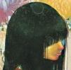
 Which is why the news that Bloomsbury is republishing the Harry Potter paperbacks with brand new covers (above and below) to, in their words, "appeal to the next generation of readers who did not 'grow up' with Harry Potter and who have not yet experienced the thrill of life at Hogwarts"* makes me feel simultaneously very old and very excited. Old because I practically grew up with Harry Potter, which ran in tandem with my own school life as far as Book 4- in fact, the end of Book 7 felt like the true end of my adolescence - and thrilled because, well, the covers look absolutely gorgeous. Clare Melinsky's linocut illustrations are not only beautiful, with not a line out of place, they've also managed to capture the most crucial moments of each story in a way that almost makes me want to cry about why these couldn't have been the first-edition covers for the books. If there are any Harry Potter fangirls reading this, I suggest clicking on the pictures to see them full-sized (the actual books won't be on sale till November 1st of this year though) . 
 Especially the last one. It feels so final, in a way the current cover for Deathly Hallows just doesn't.
 * That's what they say. I'm just glad someone at Bloomsbury decided that the current covers suck enough to need replacing.

 Especially the last one. It feels so final, in a way the current cover for Deathly Hallows just doesn't.
 * That's what they say. I'm just glad someone at Bloomsbury decided that the current covers suck enough to need replacing.
 images from www.mugglenet.com
7 comments:
Very cool! And I like the retro look -- like an old Penguin edition perhaps. Reminds me of a set of Narnia covers.
I quite liked the Bloomsies. Thought they were way better than the Scholastic covers, at least!
I heartily agree, these covers seem fitting, more along the lines of something like Lord of the Rings.
Also: It always kind of bothered me that Harry on the US covers looked a lot like the illustrator herself...very suspicious...
fucking grow up and read REAL literature!
^I read plenty. Save your bile for the Twihards, troll.
Cool. I like these new covers, they look more vibrant!
I'm a massive HP nerd too and I grew up with it - agreed about being constantly disappointed with the covers, they were hideous. I love these!
Post a Comment